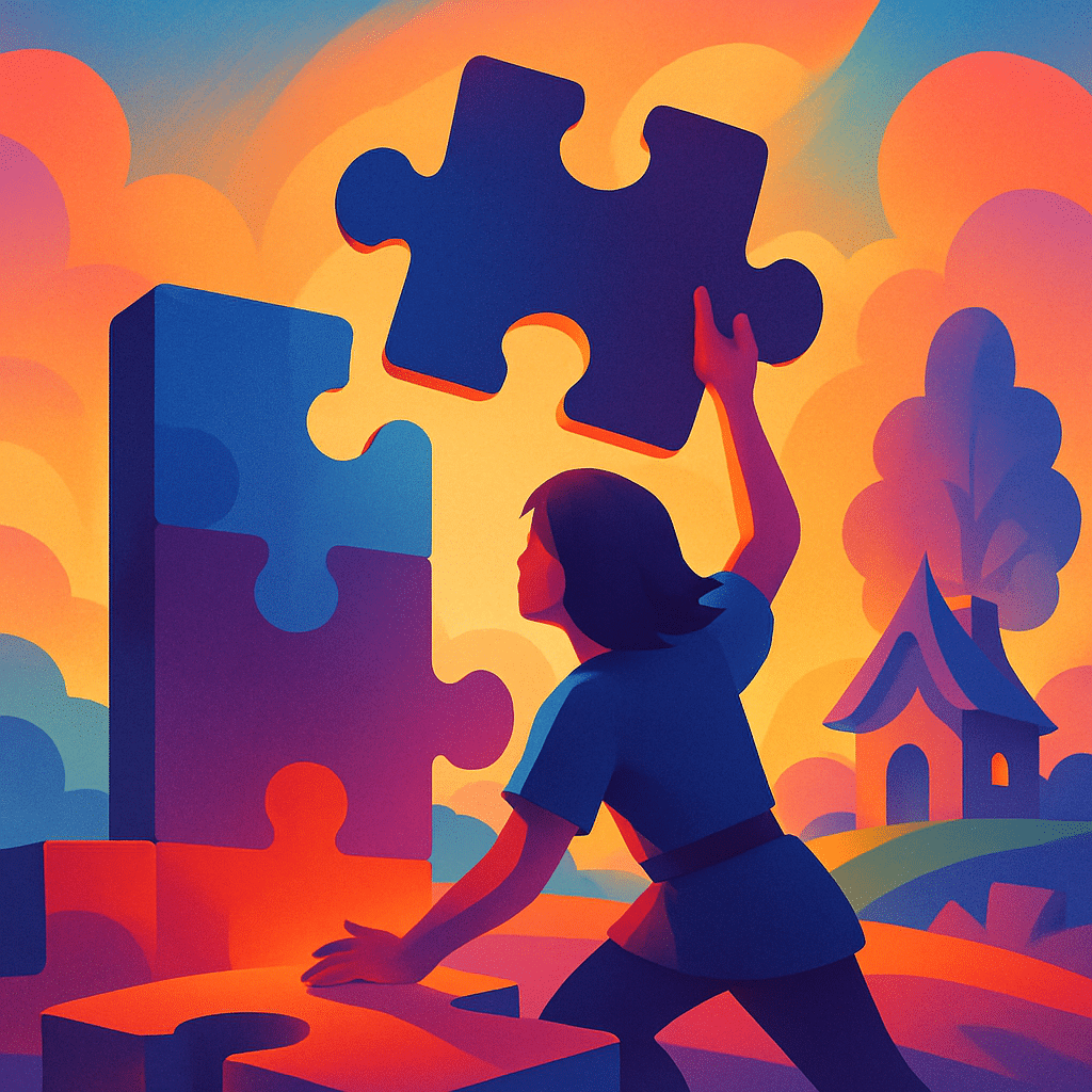
Great jigsaw puzzles are not created by accident. Behind every enjoyable puzzle lies a thoughtful use of visual design principles—color, composition, contrast, balance, and structure. When applied correctly, these principles turn a simple image into an engaging, intuitive, and rewarding puzzle-solving experience. In this article, we explore how core design concepts influence difficulty, enjoyment, and the overall flow of assembling a jigsaw puzzle.
Why Visual Design Matters in Jigsaw Puzzles
Visual design shapes how solvers interact with an image. A puzzle with clear color transitions, balanced spacing, and identifiable shapes guides the player naturally. Poor design, on the other hand, creates unnecessary frustration and slows progress. Understanding these design principles can help puzzle creators produce better images—and help solvers appreciate why certain puzzles feel more enjoyable.
Core Principles of Visual Design in Puzzles
1. Color Theory and Color Distribution
Color is one of the most important visual elements in a jigsaw puzzle. It influences both the difficulty level and the satisfaction of assembly.
- High-contrast colors make regions easy to separate.
- Gradients create visual clues for directional sorting.
- Balanced color zones prevent large “flat” areas that feel identical.
How Color Affects Puzzle Flow
Clear color segmentation allows solvers to sort pieces efficiently. A puzzle with too many similar shades often feels slow and repetitive, while varied tones keep engagement high.
2. Composition and Focal Points
A well-composed puzzle image has structure. Visual hierarchy and focal points guide the solver’s eye and make the assembly feel logical rather than chaotic.
- A central focal point offers an anchor for early progress.
- Secondary landmarks help fill in the mid-stage assembly.
- Clear foreground and background separation improves piece identification.
“Good composition gives solvers a roadmap. Even without instructions, the image teaches you where to begin and how to move forward.”
3. Contrast and Edge Clarity
Contrast allows important shapes and boundaries to stand out. Without it, pieces look interchangeable and difficult to place.
Types of Contrast Used in Puzzle Design
| Contrast Type | Effect on Puzzle |
|---|---|
| Color contrast | Makes regions easy to distinguish |
| Light–dark contrast | Creates depth and highlights details |
| Texture contrast | Helps identify objects through pattern |
4. Balance and Symmetry
Balanced images feel harmonious and intuitive. Symmetry—when used carefully—can reduce confusion while still supporting a visually appealing layout.
- Horizontal balance helps distribute colors and shapes evenly.
- Asymmetric balance adds interest without overwhelming the solver.
- Radial layouts work well for mandalas, flowers, or geometric puzzles.
5. Visual Texture and Detail
Texture gives solvers more information to work with. A puzzle featuring detailed elements such as fur, leaves, waves, or brick patterns offers dozens of small identifiable clues.
Choosing the Right Level of Detail
The goal is to find a balance: too little detail makes the puzzle feel flat; too much creates visual noise. Designers aim for recognizable textures that support natural piece sorting.
How These Principles Work Together
The best jigsaw puzzles integrate multiple design principles seamlessly. A well-balanced image with clear contrast, rich texture, and smart composition creates a puzzle that feels intuitive from start to finish. These puzzles not only look beautiful on the box—they offer a smooth, satisfying progression as pieces fall into place.
Final Thoughts
Whether you’re creating puzzle artwork or choosing your next puzzle to solve, understanding the principles of visual design can dramatically improve the experience. Color harmony, contrast, balance, and composition all contribute to how enjoyable and engaging a puzzle becomes. When these principles come together, the result is more than just an image—it’s a visual journey that unfolds piece by piece.
Leave a Reply