Why Bold Colors Matter in Puzzle Design
Bold color palettes are one of the most effective ways to create puzzle scenes that feel exciting, memorable, and satisfying to complete. Whether you’re assembling a fantasy landscape, a modern flat illustration, or a detailed cityscape, strong colors help guide the eye and transform the solving process into something intuitive and enjoyable. High-contrast colors, vibrant gradients, and carefully chosen palettes reduce confusion and give puzzlers natural visual anchors.
In puzzle design, color is more than just decoration — it shapes how players interact with the artwork. Bright hues create clear zones, help with piece sorting, and keep the entire image visually engaging from start to finish.
What Makes a Color Palette “Bold”?
A bold palette is characterized by high saturation, strong contrast, and distinct color blocks. These palettes often use expressive combinations such as turquoise and orange, neon purples, deep reds, or luminous golds. A good bold palette stands out from a distance and maintains clarity even when the image is divided into hundreds or thousands of pieces.
Key Characteristics of Bold Color Palettes
- High saturation levels that make sections easy to distinguish
- Strong contrast between light and dark areas
- Clear separation of color zones
- Vibrant transitions that guide the puzzler
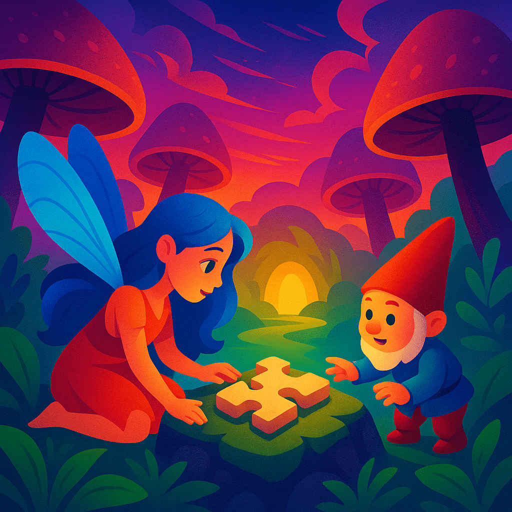
Example: Sunset Scenes
Rich oranges, reds, purples, and blues create stunning contrast and make individual puzzle pieces visually unique. These palettes consistently rank among the most popular choices for puzzle enthusiasts.
How Bold Colors Improve the Puzzle-Solving Experience
Color plays a major role in how quickly and confidently a puzzler progresses. Bold palettes enhance clarity and reduce guesswork — two essential elements for a satisfying puzzle.
1. Faster Sorting
Bright sections allow puzzlers to divide pieces quickly. When each color group is clearly defined, the early stage of solving becomes much smoother.
2. Natural Visual Anchors
Areas with distinct hues act as anchors. For example, a bright yellow sun, a teal river, or magenta clouds help define the structure of the puzzle early on.
3. Reduced Visual Fatigue
Low-contrast or muted images can strain the eyes. Meanwhile, bold palettes keep the image readable, even for long solving sessions.
Popular Bold Palettes for Puzzle Scenes
Some color combinations consistently produce great puzzle scenes because they balance clarity with artistic beauty.
| Palette Type | Color Examples | Why It Works |
|---|---|---|
| Sunset Gradient | Orange, red, purple, deep blue | High contrast and smooth transitions |
| Fantasy Neon | Pink, electric blue, violet | Vibrant and visually striking |
| Tropical Brights | Turquoise, lime, coral | Clear zones and playful energy |
| Autumn Contrast | Gold, rust, forest green | Warm tones with grounded shadows |
How Puzzle Designers Use Bold Colors Strategically
Designers don’t choose bold palettes randomly. They carefully position colors to build visual flow and create distinct solving paths.
Highlighting Key Areas
Bright colors often mark the focal points of the artwork — the centerpiece that draws attention and helps the puzzler orient themselves.
Balancing Chaos and Control
A palette may be bold, but it must also be structured. Designers use transitions, color blocking, and gradients to maintain coherence.
Creating Emotional Atmosphere
Bold colors can evoke excitement, magic, warmth, or adventure. This emotional connection makes the puzzle feel more immersive.
Tips for Choosing Bold-Color Puzzles
If you enjoy vibrant and visually clear puzzles, bold color palettes are the perfect choice. Here are simple tips for picking great ones:
- Look for scenes with distinct zones (sky, foreground, characters, etc.).
- Check that colors are evenly distributed — not all bold tones in one corner.
- Select images with good contrast between objects and background.
- Avoid over-saturated palettes that blur details.
- Choose color themes that match your solving mood — calming or energizing.
Final Thoughts
Bold color palettes elevate puzzle scenes by combining beauty with accessibility. Their vivid hues make images more engaging and pieces easier to recognize, creating a deeply satisfying workflow from start to finish. Whether you’re assembling a glowing fantasy landscape or a neon city skyline, bold colors ensure that the puzzle is as enjoyable to solve as it is to admire. With the right palette, even complex scenes become approachable, exciting, and unforgettable.
Leave a Reply